
Background
After receiving a foundational research report from the UX research team, we identified that one of the common Jobs to Be Done (JTBD) is 'restocking.' Unlike our restaurant-ordering counterpart, we found that users tend to purchase the same items routinely. With this insight, we reviewed how our product currently addresses this use case and identified any gaps.
My role
I championed this area for further exploration and led the design efforts for the project, collaborating with user researchers, product analysts, product managers, developers, and business stakeholders.
The start - Reviewing THE existing flow
The UX research team conducted foundational research to understand how users shop for groceries, identifying three user types: impromptu/convenience, top-up/inspiration, and restock. The research revealed a common pattern—grocery users tend to repurchase the same items regularly. To validate this, we collaborated with product analysts to explore the data from a quantitative perspective and identify any recurring patterns. Additionally, we worked with the product analysts to pinpoint any shortcomings in our current offering

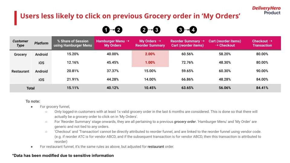

Identifying problems
Based on the quantitative findings, we have confirmed that users do reOrder certain items periodically, and that our current offering is lacking for some use cases. We set out to fix several of the problems identified:
No clear entry points
Users had limited editing ability of their previous orders
It was difficult for users to add new items from their previously ordered store
Benchmarking
We benchmarked our reorder flows against competitors to assess their strengths and weaknesses, focusing on improving areas where they fell short. Our benchmarking process included regional industry leaders, market leaders, products favored by business stakeholders, similar products, and sister apps within the DH brand.
For reorder analysis, we examined platforms such as Instacart, Amazon, Gorillas, Grab, Swiggy, Talabat, Baemin, Uber Eats, and Wolt
Ideating
We synthesize all the data gathered from UX research, analytics, and benchmarking to create screens and user flows for the feature. Throughout this process, we hold weekly meetings with UX researchers, product analysts, developers, and product managers to ensure confidence in our solutions. We also take this opportunity to reach out to other squads with potential dependencies and brands to gain insights. Coincidentally, at this time, the restaurant team was looking to revamp their reorder flow, which allowed us to share learnings and collaborate effectively.
Additional things we wanted to look at
We aimed to explore how to introduce new tile types on the Shop Listing Page (SLP) to break up its uniform appearance. Our goal was to create contrast that would help content stand out and make it easier for users to process information. Additionally, we wanted to examine the potential for setting up recurring orders. To gauge interest in this concept, we planned a painted door test alongside this flow.
Fine tuning and usability testing
Throughout the project, we continuously refined the designs as new information emerged. We conducted guerrilla-style user testing to quickly validate the user flow and discovered that the UI was too cluttered, leading us to remove much of the unnecessary noise. We also made further adjustments to the shop listing tiles.


End Results
Designs were given to the newly formed reorder squad. They took these designs to implement for groceries in 2022.